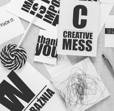
The Unexpected Power of Typography: How Fonts Shape Small Business Success
Learn how typography shapes branding, marketing, and customer trust for small businesses. Choose the right fonts and avoid common mistakes.
GRAPHIC DESIGNWEB DESIGN
9/9/20254 min read
The Unexpected Power of Typography: How Fonts Shape Small Business Success
When you think about branding, your mind probably jumps straight to logos, colors, or imagery. But there’s one design element that quietly pulls more weight than people realize: typography.
Fonts don’t just “say words.” They set the tone, convey emotion, and tell your customers who you are before they read a single sentence. A bold sans-serif font screams confidence and modernity; a flowing script whispers elegance and artistry. The right font can build trust and recognition. The wrong one? It can confuse or even turn people away.
This week’s blog dives into why typography matters, how small businesses can use it strategically, and how to avoid the pitfalls that trip up many do-it-yourself designers.
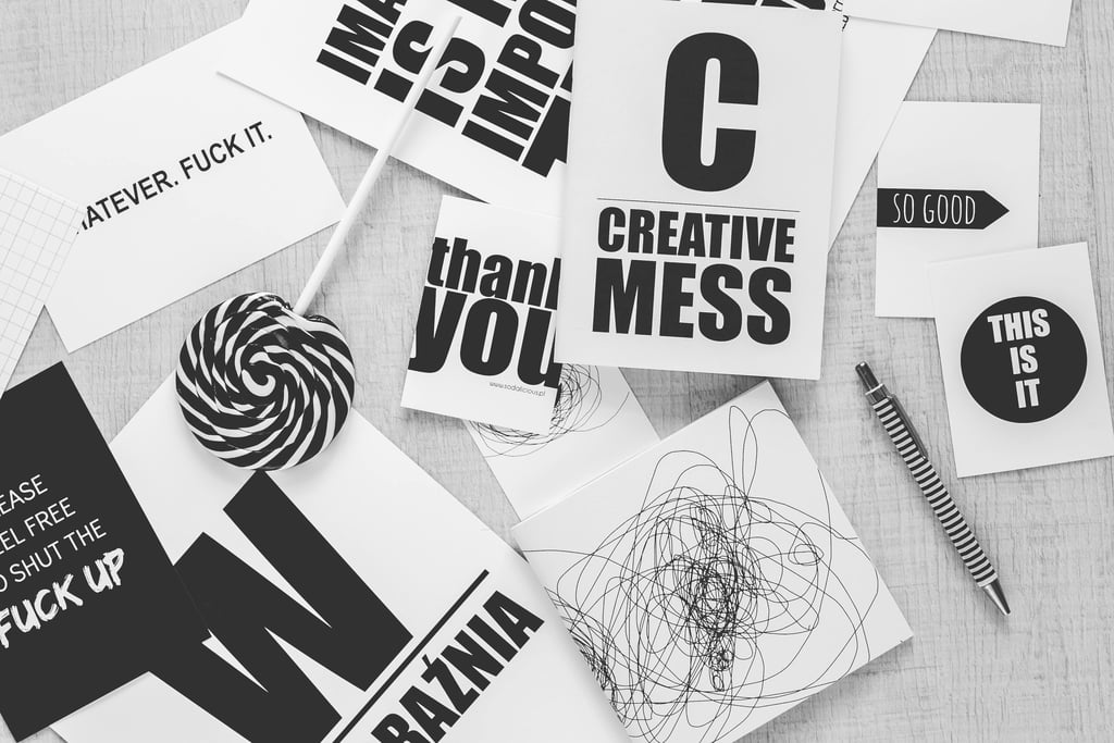
Why Typography Is More Than “Just Fonts”
Typography is the art and technique of arranging text so it’s readable, appealing, and consistent with your brand’s voice. It covers:
Font choice (Times New Roman vs. Helvetica vs. Comic Sans — please don’t).
Hierarchy (headlines, subheads, body text).
Spacing (between letters, lines, and blocks of text).
Consistency (using styles that reinforce, not fight, each other).
It’s not just decoration. Typography is a brand ambassador that communicates personality, tone, and professionalism.
First Impressions Happen in Letters
Here’s a fact that will make you look at text differently: studies show it takes people less than a second to judge the “feel” of a font. That means before they even understand your message, they’ve subconsciously formed an opinion about your brand.
A clean sans-serif font (like Arial or Helvetica) suggests modernity and clarity.
A serif font (like Georgia or Times New Roman) gives a traditional, trustworthy vibe.
A script or hand-drawn font can feel playful, personal, or elegant — depending on execution.
Typography is your handshake in visual form. Sloppy fonts = sloppy business.
The Role of Typography in Branding
Think about iconic brands:
Coca-Cola’s flowing script is instantly recognizable worldwide.
Google’s clean, colorful typeface communicates approachability.
Vogue’s tall, bold serif screams sophistication.
Each of these companies has baked typography into their DNA. Small businesses can and should do the same. A thoughtful font choice becomes a visual signature customers associate with you.
How Small Businesses Can Harness Typography
1. Start With Your Brand Personality
Ask yourself: Are you bold and modern? Traditional and trustworthy? Fun and quirky? The answer should guide your font choice.
For example:
A law firm should avoid playful comic-style fonts.
A children’s boutique could embrace rounded, whimsical lettering.
2. Limit Your Font Family
One of the fastest ways to look unprofessional is to throw a dozen fonts on one flyer. Stick with two, maybe three fonts across all branding. A good combo:
Headline font (expressive and bold).
Body font (clean, readable at small sizes).
Accent font (optional, for pull quotes or logos).
3. Think About Readability
A font might look cool, but if customers can’t read your phone number or call-to-action, it’s useless. Prioritize clarity.
4. Maintain Consistency
Use your fonts across all channels: website, social media, signage, emails. Repetition builds recognition and trust.
Typography in Marketing Materials
Typography shows up everywhere your business does:
Websites: Clear hierarchy guides visitors — big headlines, easy-to-skim body text.
Social Media Graphics: Bold fonts help posts stand out in crowded feeds.
Printed Materials: Flyers, menus, or packaging live or die by font legibility.
Logos: Sometimes a font alone is the logo (think FedEx or Netflix).
Even email signatures benefit from polished typography — it’s often the last impression you leave.
Common Typography Mistakes (and How to Avoid Them)
Overusing Fonts
More fonts = chaos. Stick with two or three.Ignoring Hierarchy
Headlines, subheads, and body text should be visually distinct.Bad Color Contrast
Light gray text on a white background is a reader’s nightmare.Using “Trendy” Fonts Everywhere
What looks cool today may look outdated tomorrow. Build your brand on timeless choices.Relying on Default Fonts Only
Arial and Times New Roman work in a pinch, but they won’t set you apart. Explore free resources like Google Fonts.
How Typography Affects Customer Behavior
Here’s the real magic: typography influences how people feel about your message.
Fonts can make prices feel higher or lower.
Serif fonts tend to inspire trust, making them great for industries like finance or healthcare.
Sans-serifs feel more affordable, approachable, and tech-forward.
Typography can literally affect conversion rates — whether someone clicks “buy,” signs up for your newsletter, or calls your business.
Tools to Get Started
You don’t need to be a designer to experiment with fonts. Try these tools:
Google Fonts: Free, easy-to-use library.
Canva: Offers curated font pairings for non-designers.
FontPair.co: Helps you find professional font combinations.
WhatTheFont: Upload an image to identify any font.
These resources help small businesses keep design professional without the cost of hiring a full-time designer.
Final Thoughts
Typography isn’t just the cherry on top of design — it’s the foundation. The right fonts communicate trust, professionalism, and personality. They guide your customers through information, build recognition, and shape how people feel about your brand.
So the next time you put together a flyer, update your website, or post on social media, don’t just “pick a font.” Think of it as choosing your voice. Make sure it’s saying exactly what you want.
If you’re ready to tighten up your brand’s visuals, start with typography. It’s one of the cheapest, easiest, and most impactful changes you can make.ere...
Get a FREE Consultation
Your project starts with a free consultation — a no-pressure virtual meeting where we talk through your goals, ideas, and challenges. This helps me understand your vision and gives you clear guidance on how I can help, what services fit your needs, and what pricing to expect. It’s a chance to ask questions, get expert advice, and see if we’re the right fit — all before committing.

Connect
Explore creative solutions for your unique vision.
Inspire
Create
info@TheMediaMechanic.com
(312) 626-5512
www.shawnallenbell.com © 2025. All rights reserved.